Confused!!.. Which colour to go for the Interiors? Here is a guide..
Have you ever felt uncomfortable in a room without knowing why? It may have had something to do with the colours in which it was decorated. This had something to do with the colours which were prominent in the interiors. It is simply about selecting the most suitable colours for a particular room.
The purpose of the room must be considered, for example you want calm colours for rooms in which you will be resting, stimulating colours for rooms in which you will be active. It also makes sense to choose colours that you like, and which rest of the household likes as well. There are thousands of shades, tints, and tones of colours available, so here I am to help you out to decide what colour scheme fits which room.
The living/drawing room
You must keep in mind what ambience you want to create in your living and sort of activities that will take place. Is it specifically designed for relaxing and watching television? Or you do a lot of entertaining? Or if this room is the main meeting place of the household? In the first case, you need restful and calm colours that will help you switch off from the concerns of the day. Light green and pale pinks are welcoming yet calming. Whereas in the second case, you might prefer to choose gently stimulating colours that will encourage everyone to mingle and chat. Using orange-yellowish colours such as peach and coral would make sense.
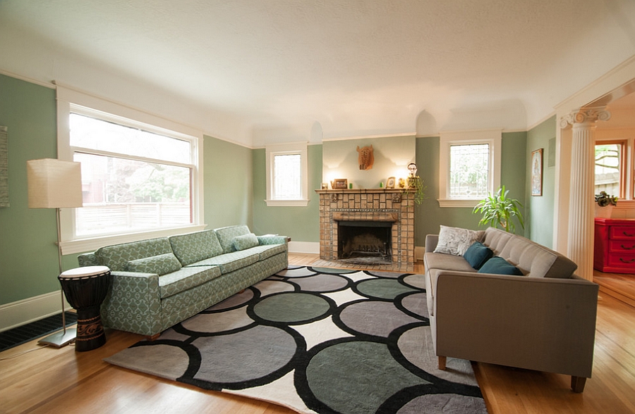
Source: Decoist
 Source: Elle Decor
The bedroom
When choosing colour for your bedroom, you must consider what you want it to be, seductive or romantic; or peaceful and comfy? Especially if you are a light sleeper, you must choose colour that will help you sleep well. Too much yellow should be avoided due to its ability to stimulate the mind may lead to sleeplessness at night with endless thoughts running through you head. One should be really careful while using red, even though can create a sensual, warm atmosphere that is perfect for sharing with a partner, can be overpowering when used in great quantity. You can introduce some amount of it through lampshades, curtains and mats but should avoid using red sheets and pillow covers because it might make you restless and claustrophobic. Light pink is a good compromise, as it creates a safe, loving atmosphere. Blue is one of the most suitable colours, especially the a warm blue, such as cobalt or cerulean. If you don’t want to use on your walls, you can consider using it on your bedding.

Source: hgtv.com

Source: Pinterest via stevelarese.com
The kitchen
It is a good idea to decorate it in colours that look clean and stimulating like, a neutral tint. If your friends and family congregate around your kitchen table, relaxing and enjoying themselves, warm oranges, terracotta and pinkish reds can be used. Yellow textures can be added to encourage lively conversation. You can always add colour with bowls, storage containers and other accessories.

Source: Zillow DigsTM

Source: Decoist
The bathroom
If you prefer a bathroom that always looks clean and hygienic, blue and white is a highly effective combination. Introduce silver in form of sparkling chrome bathroom fittings. For a more sybaritic experience, you could use warm pink which are relaxing and turquoises for a sensual, hedonistic bathroom where you retreat for long pampering sessions.
 Source: http://georginagibsoninteriordesign.com/portfolio-item/luxurious-family-bathroom/
Source: Houzz
The study or home office
If your work or study involves plenty of thought and mental agility, you should introduce touches of yellow to the room. Too much of it will though make it hard to concentrate. If your work involves self-expression, your room should incorporate blue and orange. And if you need excessive silent and calm atmosphere add touches of violet and amethyst can be added.

Source: oceanboulevardtaxi.com
Via working with colour healing


Comments
Post a Comment